Brand Kit
Everything you need to refer to PrivacyTools: logos, the shield mark, colors, and the rules that keep them looking right. Every asset comes as SVG and transparent PNG, free to use when linking to or writing about privacytools.io.
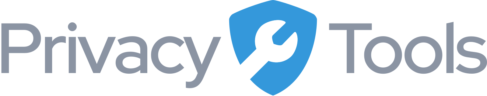
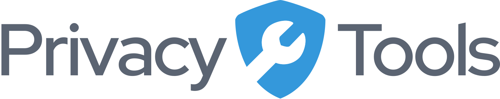
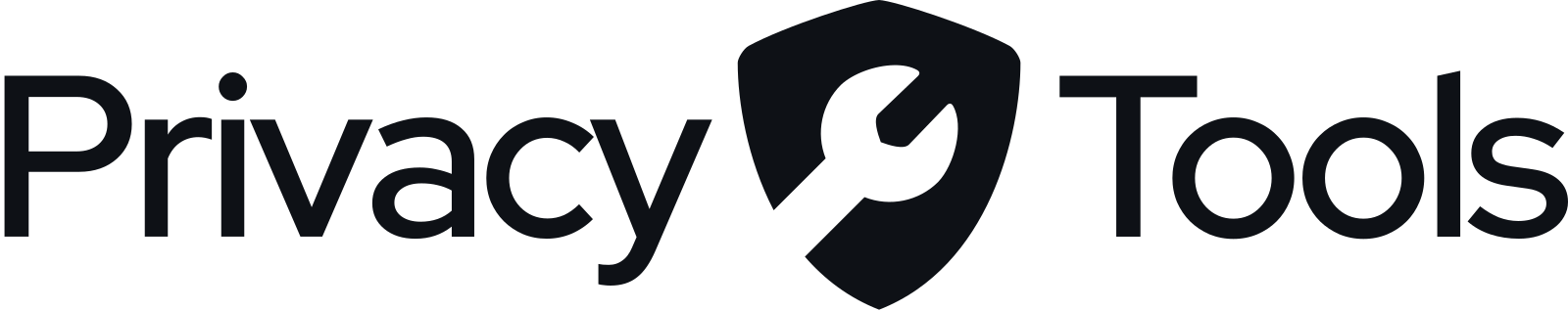
Logo
The horizontal lockup is the primary logo. Pick the variant that matches your background.
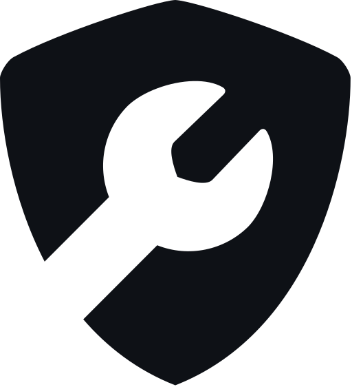
Shield mark
The shield stands on its own wherever the full lockup doesn't fit.


Colors
Shield Blue is the brand. The rest is the Clean Slate interface palette, dark-first.
Shield Blue #3498db
Primary brand color. The shield. Accent in dark mode.
Shield Blue, deep #1f74ad
Accent in light mode. Same hue, darkened for contrast.
Dark theme
#0a0d12 #11151c #181d26 #222936 #e8ebf0 #8b94a3 #34d399 Light theme
#f6f7f9 #ffffff #eef0f3 #e2e5ea #0e1116 #5b6472 #059669 Typography
Inter
One typeface, everywhere. Weights 400 to 800. Headlines extrabold with tight tracking, body regular. No second typeface, no exceptions.
Usage
Do
- Use the provided files as-is: SVG wherever possible, PNG where SVG is not supported.
- Give the logo clear space of at least the shield’s width on all sides.
- Use the shield mark alone when space is tight: avatars, favicons, social icons.
- Write the name as one word, PrivacyTools, or as the domain, privacytools.io.
Don't
- Don’t recolor, stretch, rotate, outline, or add shadows and effects.
- Don’t darken the wrench. It is white in color versions and knocked out in monochrome, never black.
- Don’t set the wordmark in another typeface or rebuild it as text.
- Don’t place the lockup on busy imagery; use a monochrome variant instead.
- Don’t use the logo to imply endorsement of a product or service.
Questions, or need something not listed here? Write to hi@oneguy.me.